DESIGN TIPS FROM OUR ORIGIN MAGAZINE FEATURE
Paige Hull
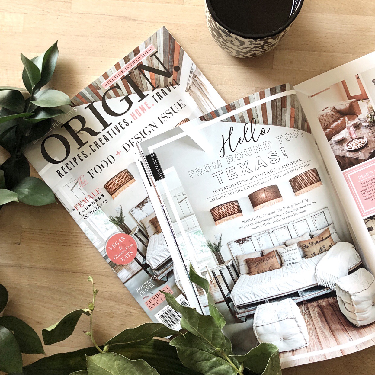
We’ve been so proud to have been featured on the cover of ORIGIN magazine’s food and design issue! Although we’ve been fortunate enough to have been included in many publications in the past, our ORIGIN feature was our first cover story—truly a pinch-me moment!
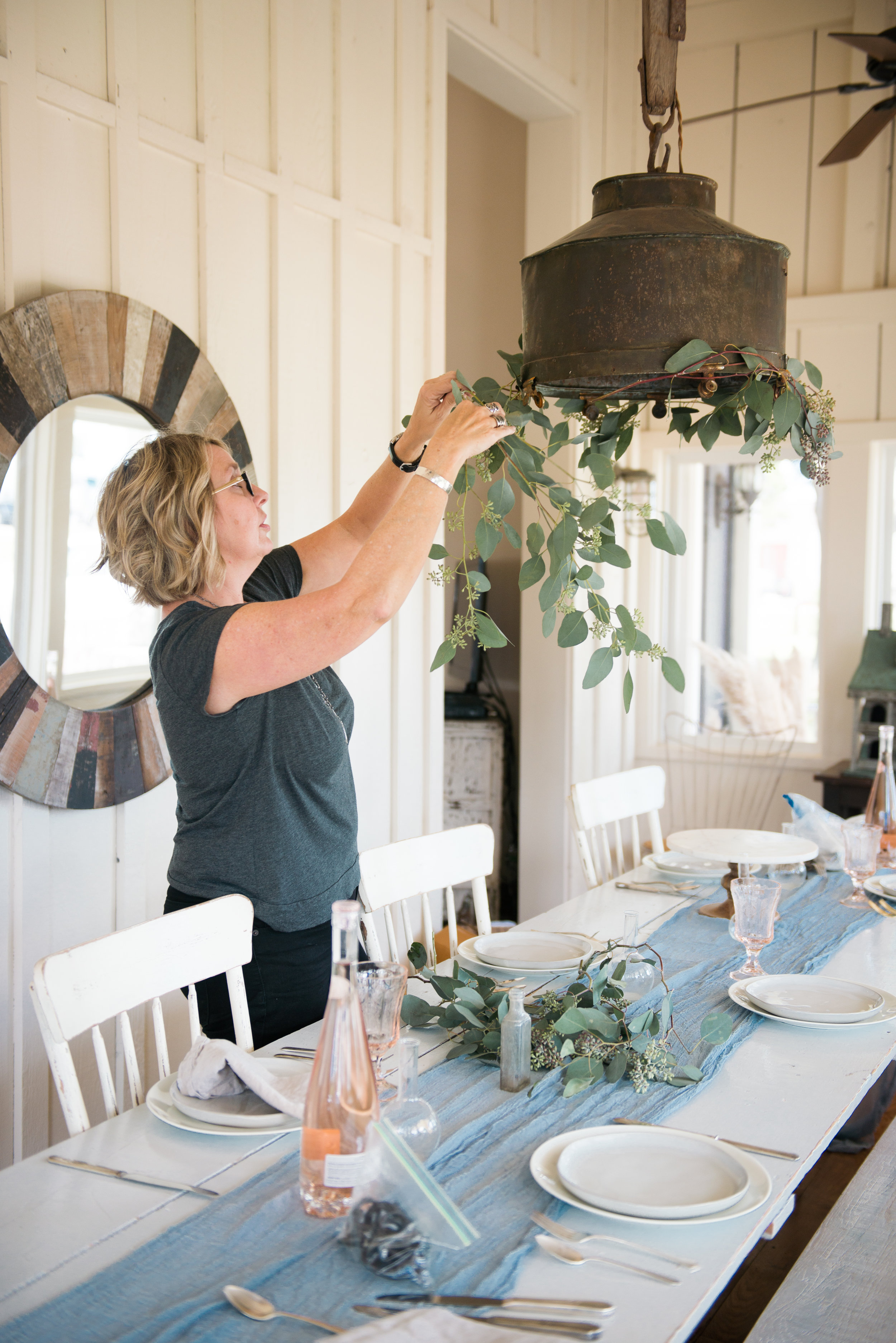
As a new issue of ORIGIN makes its way to newsstands, we want to thank the Maranda, Ana, and their entire staff for working with us and their interest in our design aesthetic. We also thought we’d celebrate this feature by including a few of the behind-the-scenes photos from the shoot along with some of our design tips!
If you didn’t get a chance to pick up a print copy of the magazine, you can purchase a digital download of the issue that features The Vintage Round Top—along with other past issues of ORIGIN!—here.
Our number-one design rule is…not to follow rules! Smoot and I have never been very good at following rules. Honestly, the best design rule is to simply follow your heart. Mixing vintage pieces in a very layered and super-clean aesthetic is what feels right in my heart, and that is what has defined our approach to design.
While we don’t really design according to set rules, we can definitely distill our aesthetic into a few key elements.
Open floor plans with lots of windows provide plenty of natural light and invite the outdoors in. We try to create those conditions as much as possible.
We also rely heavily on clean, modern lines and a neutral color palette that provide a sleek contrast with textural elements and vintage pieces. When styling with vintage items, our goal is to lend depth, soul, and feeling to a space. We also try to incorporate pieces acquired during our travels as a visual reminder of a meaningful family trip.
Lastly, don’t forget comfort! We want every space we design to be functional and feel lived-in. That means comfortable seating, soft throws, and cushy pillows that invite guests to relax.
Don’t rush the process of picking a paint color. A tiny variation in hue can really make or break an entire room, so it’s important to get it right! I always buy samples and paint as many swatches as possible on several different walls. Then I live with them for a few days and compare how they look in different lighting conditions—a sunny day, a cloudy day, nighttime, with bright indoor lighting, etc. before deciding which one works the best.
Our go-to shade? White. There are so many different shades of it! White paint allows for a little more freedom when it comes to texture and style—plus, we love how light bounces off white and makes a room feel open and fresh.
We happen to love the unique character that vintage pieces bring to interior design, but they can also serve as a way to reduce costs. And if environmental sustainability is important to you, then using repurposed materials is a great way to cut down on waste. We’ve created most of our lighting fixtures out of found or reclaimed materials, and we’ve sourced many of our construction materials from Habitat Humanity ReStore. It feels amazing to give an antique vanity or reclaimed lumber a new life and purpose.
Many thanks to our amazing team of collaborators! Each one really helped this shoot become something special.
Photography: Haylei Smith
Styling: Becki Griffin | Curious Details
Vintage Place Settings: Pure Vintage Rentals
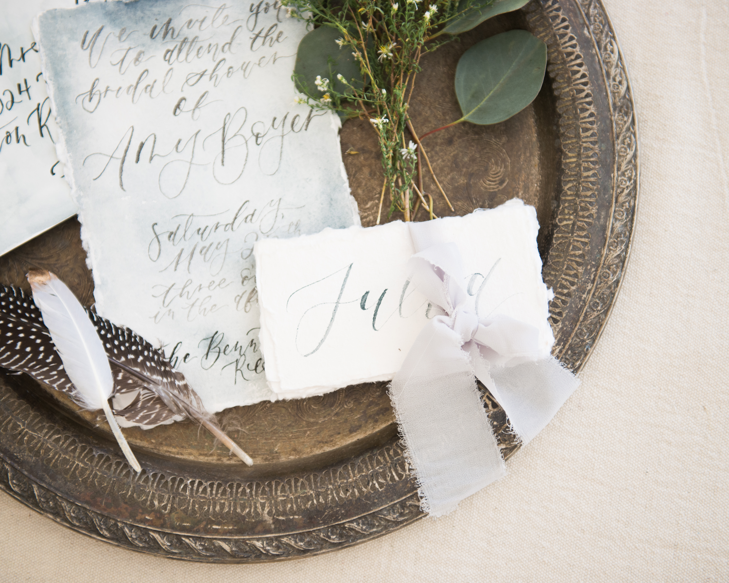
Calligraphy: Upstairs Paper Studio
Baked Goods: Hey Sugar Cookies


